Responsive Day Out in Brighton
July 1, 2015
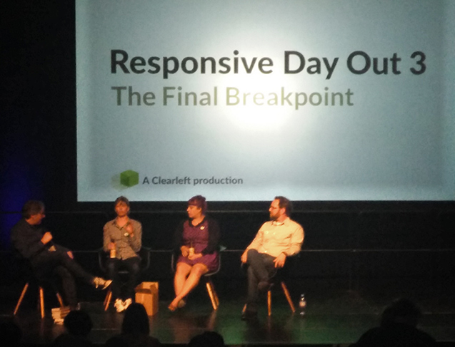
I was recently lucky enough to attend the Responsive Day Out conference in sunny Brighton. Unlike a lot of events in our industry, this was and very affordable and pared-down affair. But the lack of badges and goody bags was more than made up by the varied talks from the speakers!
The conference had an unusual format - four sessions with a common theme, which comprised a 20-25 minute talk from three of the speakers, followed by a Q&A between them and our host, Jeremy Keith.
There were so many interesting talks, but some of my highlights include...
Accessibility
Alice Bartlett and Rachel Shillcock both spoke about the importance of making our web sites accessible. I think as an industry, we've often thought that accessibility begins and ends with blind people and screen readers. In reality, it's about making our content available to all.
In her work at GDS, Alice found no studies which have concluded any financial benefits to adding accessibility features to our sites, but we have a moral obligation to do it anyway.
Rachel's talk mentioned several tools that web designers can use to improve the accessibility of web sites, such as tota11y and the contrast ratio checker. Rachel has made the conscious effort to consider accessibility as a part of her design workflow.
Web Components
Peter Gasston spoke about the 'next big thing' coming to web development - components. This allows developers to create widgets that encapsulate the current mess of HTML, CSS and javascript, so they can be make reusable. For example, in the future you'll be able to add a
Apart from resulting in cleaner markup, the component can be isolated, which means styling from elsewhere on a page cannot clash with the design and functionality that the component provides.
As the specification hasn't been finalised yet, and browsers lack universal support for components, Peter recommended using a third-party library such as Polymer for experimenting at the moment.
Responsive Images
Jason Grigsby talked about the new responsive image standard, which now works in many modern browsers and is coming soon to most others.
When the HTML standard was first drawn up, everyone accessed the web on desktop computers, and therefore a one-size-fits-all approach was used. Today, the web is available on tiny mobile phones all the way up to very high resolution desktop screens.
The idea of making images responsive, is to allow us the serve a different image to different displays. There's no point in serving an ultra-high resolution image to a mobile phone. For one, the image would use up precious bandwidth and take far to long to display over 3G.
Responsive images also allow for art direction. One such example Jason gave was use of photography on a news site. We are now able to have a large overview image for desktop computers, and a tighter cropped version on mobile.
Additionally, we might use a SVG (vector graphics format that can be scaled to any size, without losing quality) on modern browsers, whilst serving a PNG image to older browsers.
Offline-first Design
Jake Archibald suggested that responsiveness in web design should also take account for our often flaky internet on mobile. He demonstrated a tool he created. After the initial load, you can revisit the page in the future, even whilst offline and it will still work!
Conclusion
There was so much more than I could ever hope to describe in a single post. I left with lots of new knowledge and much to experiment with!
If you're interested in hearing the talks yourself, or the previous events in the series, the audio is available from HuffDuffer. I believe videos are forthcoming, so keep an eye out on the Responsive Day Out web site.